Tag

responsive

Browsing

Required knowledge level: intermediate

Please note: This tutorial is still in construction and has not been finished yet. You can however already start reading and come back later again.

If you are a reader of this blog you will surely have read my previous tutorial on how to build an adaptive HTML 5 website. In the previous tutorial we created a website from scratch and we did it the manual way without the use of any framework or grid system. Personally I think it is very important to first learn how to code a website all by your self without using a framework which will take care of many things for you. So be sure to first read through my previous tutorial before continuing here.

As the first quarter of 2015 is ending, we’ve come to see many predictions being made for the web design industry. Without wasting any time, let’s discuss about some of the major web trends that are expected to evolve and will be ruling the web industry in 2015:

1. Storytelling Will Become More Animated

You may have stumbled upon several websites that tell a story. Though storytelling isn’t new and has been around us for ages, but it’s only recently that it made its way into the design industry, by making use of animations and other interactive elements.

And this year, you can expect to see story designs becoming even better by the use of animation sequences that starts when a user scroll down the page. In essence, more and more websites telling stories will be using 3D graphics and HD quality videos, in a bid to increase the level of visual appeal and user’s interactivity.

With Responsive being the talk of the town we will dig deeper into the know-hows of presenting the content in such a design. Responsive web design does not means to focus on images, columns, icons and grids. Wherein, these all things makes no sense without a good depiction of content.

Web typography being the scientific name of content style is what we are going to discuss in this article. With responsive being the current trend in the tech world missing out responsive typography is a sheer ignorance of any web developer and designer.

Welcome to the second part of my tutorial on how to create a WordPress HTML5 template from an existing website. Be sure to read the first part before continuing here.

We have created a new HTML5 WordPress template that currently displays our home page including a menu, that can be customized through WordPress and three new posts for our slider content boxes. The next step is to create new layouts for posts and pages. As explained in the previous part of this tutorial the navigation items “About”, “Contact” and “Portfolio” would link to pages while the “Read more” links would rather link to posts.

In this tutorial we will take the responsive website we have built in the previous tutorials and implement it into Wordpress. Wordpress is a web blog system which was originally created to be able to easily write flexible and adaptable blog posts. In the course of years the range of functions enlarged more and more so that we can now use Wordpress not only for blogs but also as a Content Management System for “normal”…

In this second part of my tutorial we will be building the CSS and JavaScript code and do the necessary steps for responsive webdesign to create this beautiful HTML5 responsive website. Be sure to have worked through the first part of the tutorial where we have built the basic HTML structure and included all necessary scripts. We have already included our CSS Reset in the last part of the tutorial. The Reset will take care…

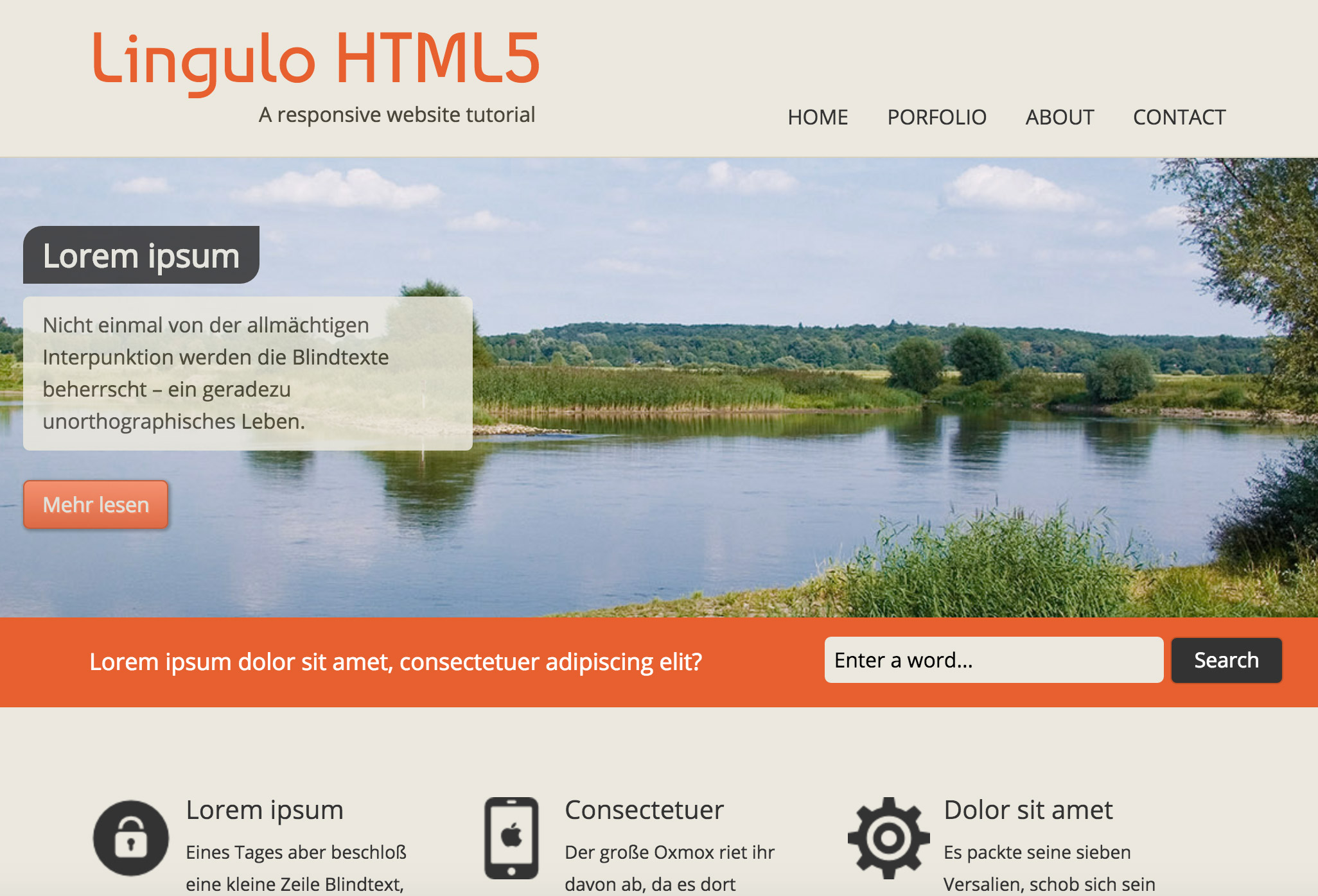
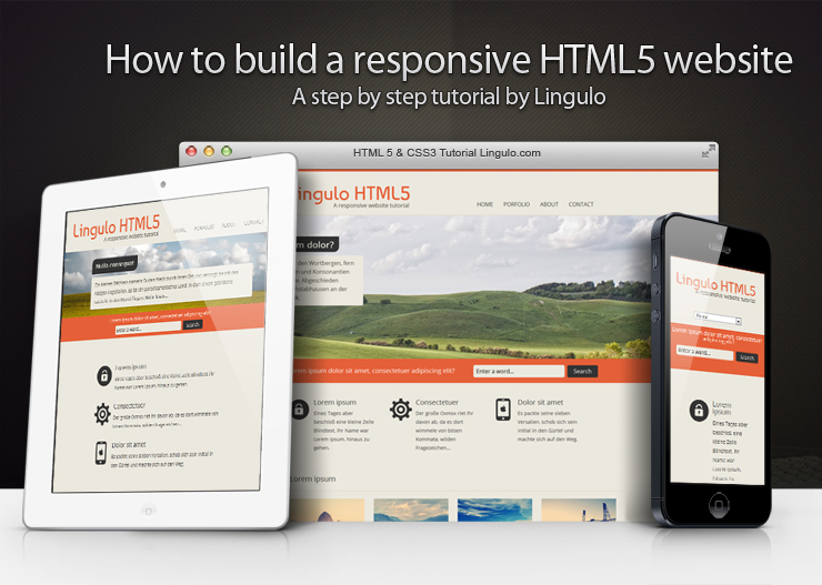
Required knowledge level: intermediate In this responsive web design tutorial we will create an awesome responsive HTML5 website starting from scratch. I tried to include as many different features as possible, so we will be dealing with a jQuery slider, CSS3 transitions and animations, CSS Media Queries and so on. This part of the tutorial will show you the HTML structure and the required scripts in a step by step tutorial. The second part will…

Benötigte Kenntnisse: mittel In diesem Tutorial werden wir Schritt für Schritt eine hübsche moderne responsive HTML5-Webseite erstellen. Ich habe versucht so viele Features wie möglich in das Tutorial zu integrieren. Wir werden uns mit einem jQuery Slider, CSS3-Transitions und CSS3-Animationen, CSS Media-Queries und noch einigem mehr beschäftigen. Der erste Teil des Tutorials wird Dir zeigen wie man die grundlegende HTML-Struktur aufbaut und welche Skripts für eine browserunabhängige Darstellung der Webseite benötigt werden. Im zweiten Teil…